


This product is a cloud-based enterprise application. It is designed to improve the efficiency of local government agencies in the U.S.
Small municipalities rely on manual data entry, leading to time-consuming process and increased potential for errors.
Simplify government clerks' workflows by automating repetitive tasks and improving easier access to essential data?
Conducted stakeholder interviews to pinpoint existing problems in the system.
Collaborated with product managers and engineers for seamless implementation.
Product designer (me)
Product Manager
UI Developer
QA
2500
Local U.S. Governments
48
U. S. States currently using
3X
Efficiency in data visualization
This enterprise application is helping thousands of clerks save weekly 20 hours in preparing accurate records in compliance with the unique government requirements for their community.

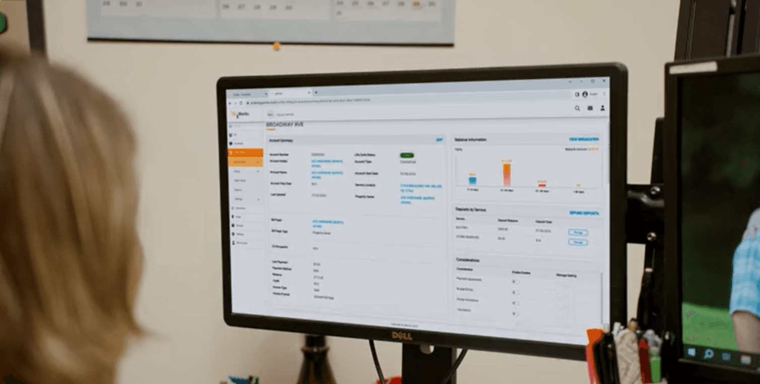
Customer account management
Easy search and filtering capabilities
Customized reports
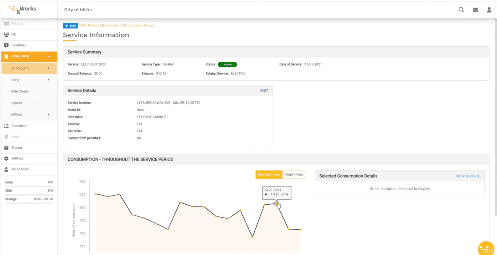
Managing large data sets
Reduced steps(20 steps to 5 steps) to understand utility usage.
Indicating critical information
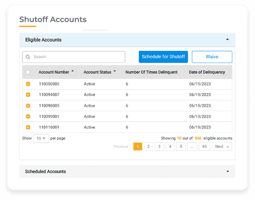
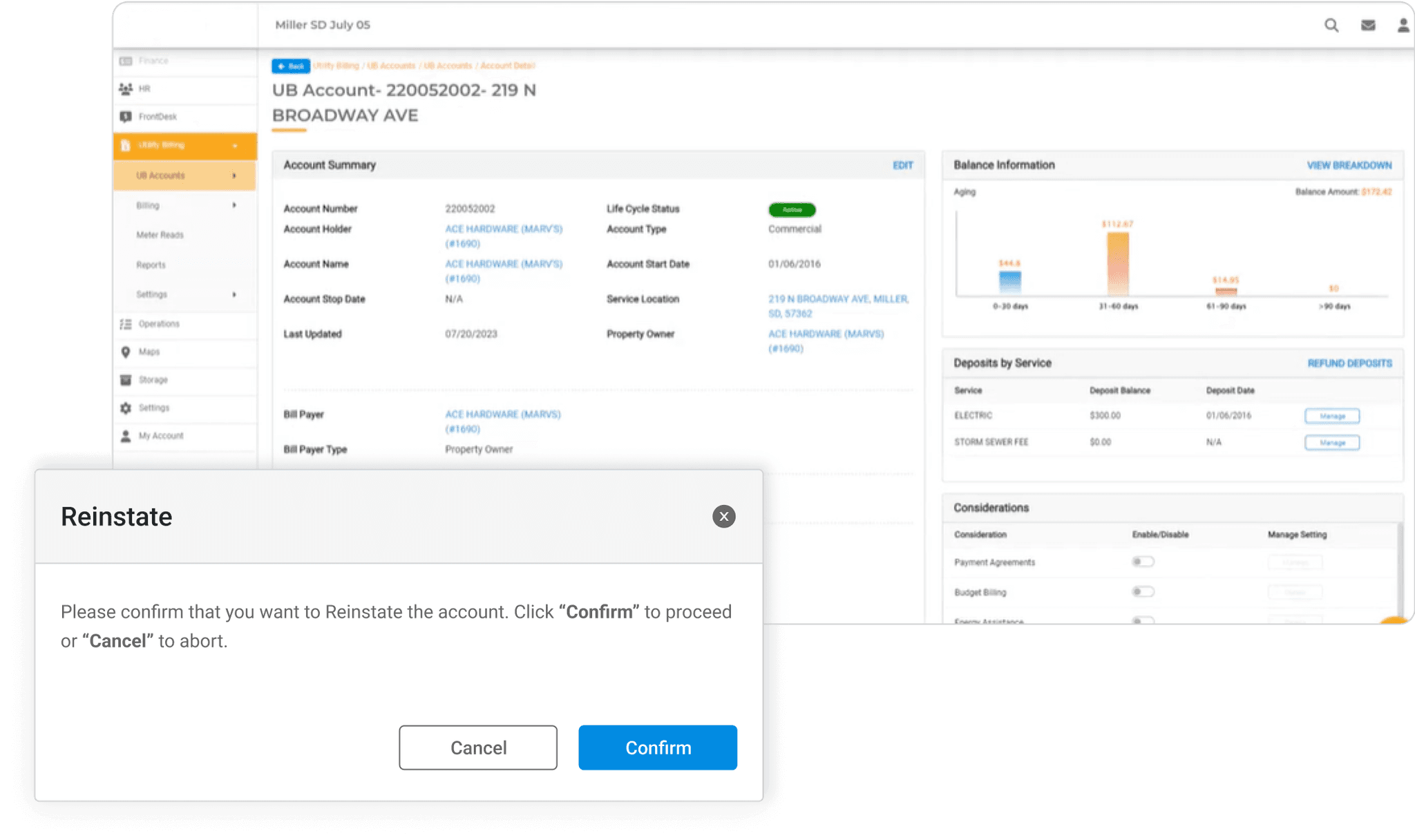
Manage shutoffs, ensuring compliance and encouraging timely payments.


Data complexity
We received large data sets from the client. It was difficult to understand the complex information we received from client.
Overcoming the challenge
Create and understand complex user flows
Conduct design workshop with users
Changing priorities
Overcoming the challenge
Inform design decisions at all stages
Understanding possible trade-offs
Actor-Network theory
This helped analyze how human and non-human entities (actors) interact within a network to shape social and technological systems.
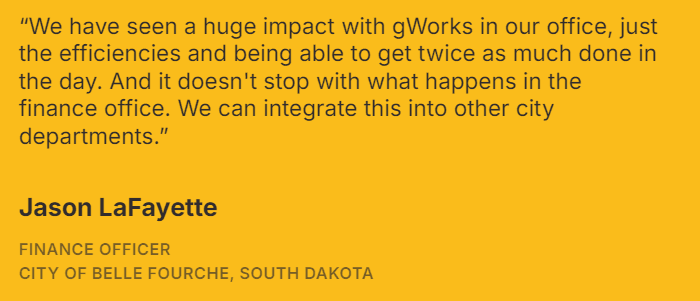
We found out services are designed to enable small local cities and rural counties leverage software and technology.

-Public Relations Manager at client company
We conducted 20+ interviews to understand how the tasks of stakeholders are corelated with the help of actor and actants.
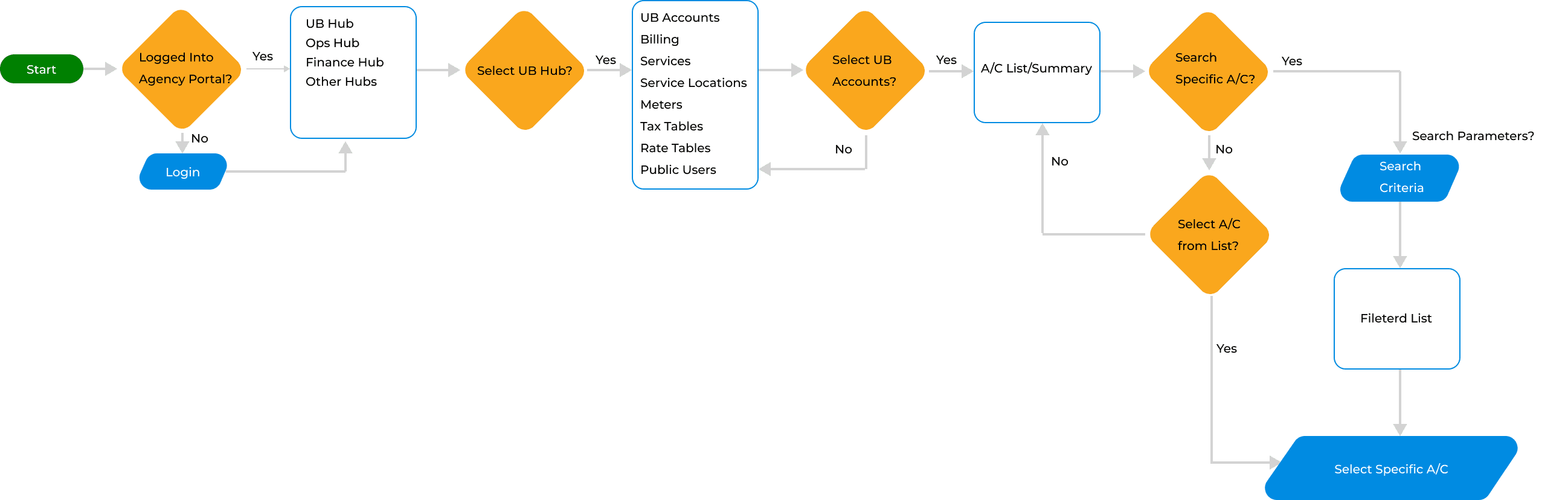
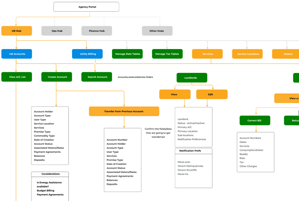
The key users of UB Hub are clerks. They handle huge datasets of customer accounts.

-Clerk at local U.S. Government
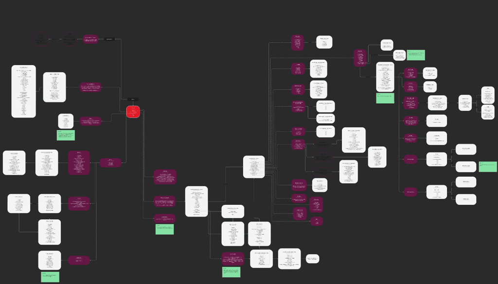
We created multiple user flows based on user journey mapping. This approach helped us creating user-centric design.
We identified 6 different functional modules that support clerks to manage their tasks
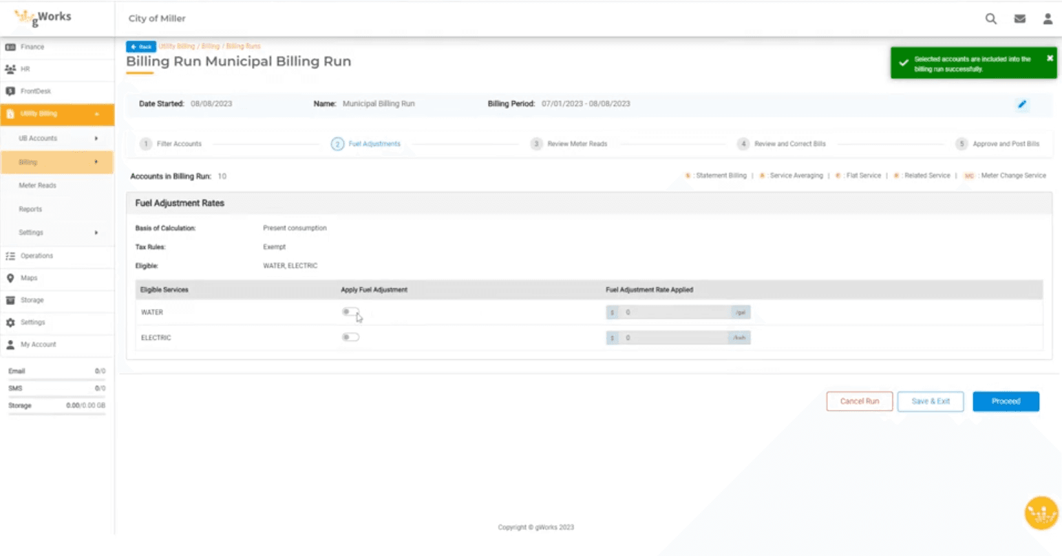
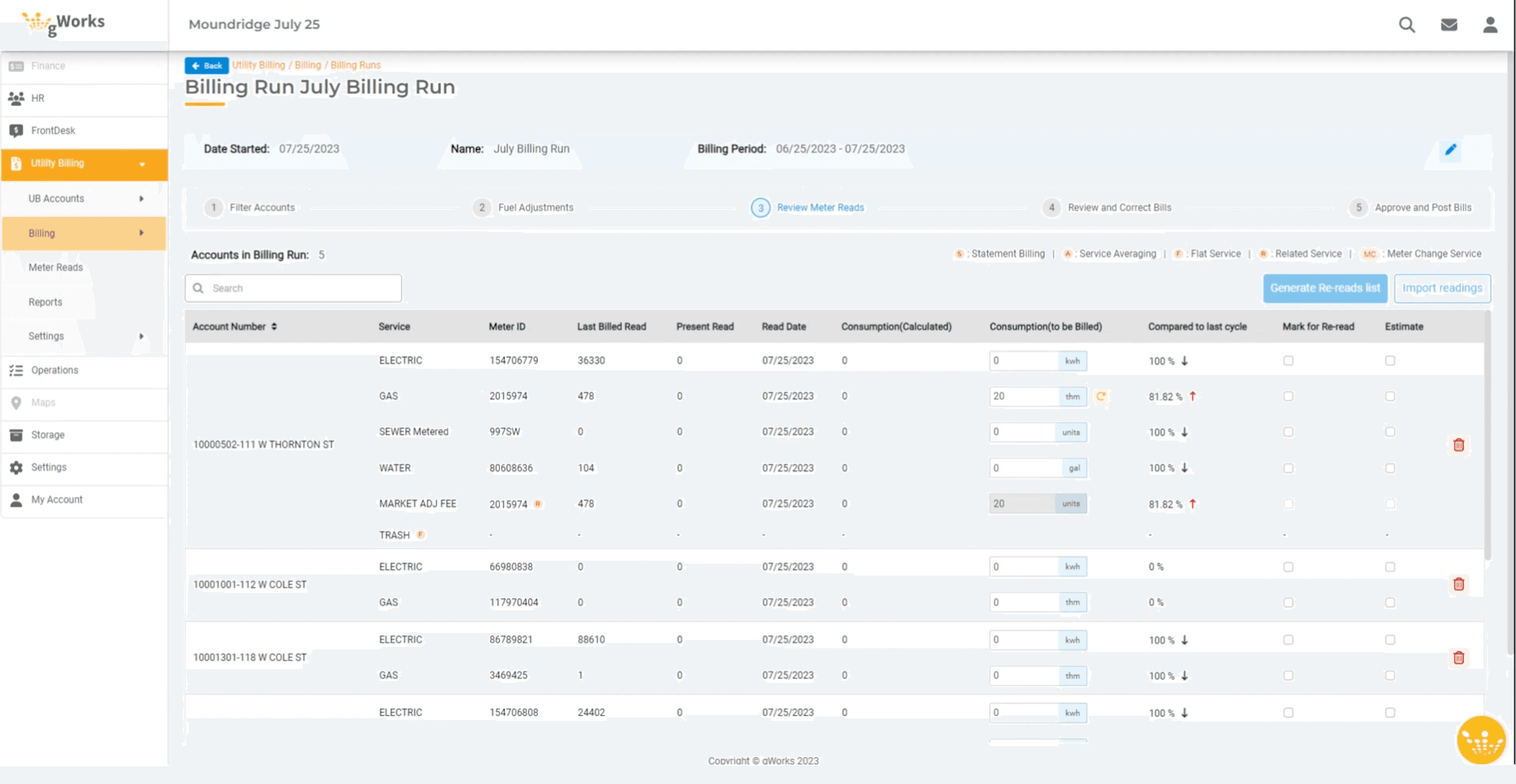
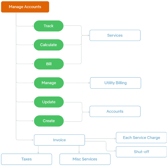
Create manual invoices
Review, correct, and refund bills based on front-desk request.
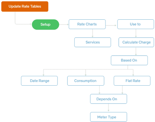
Update rate tables
Create rate charts as per meter types, flat rates, and government policies.
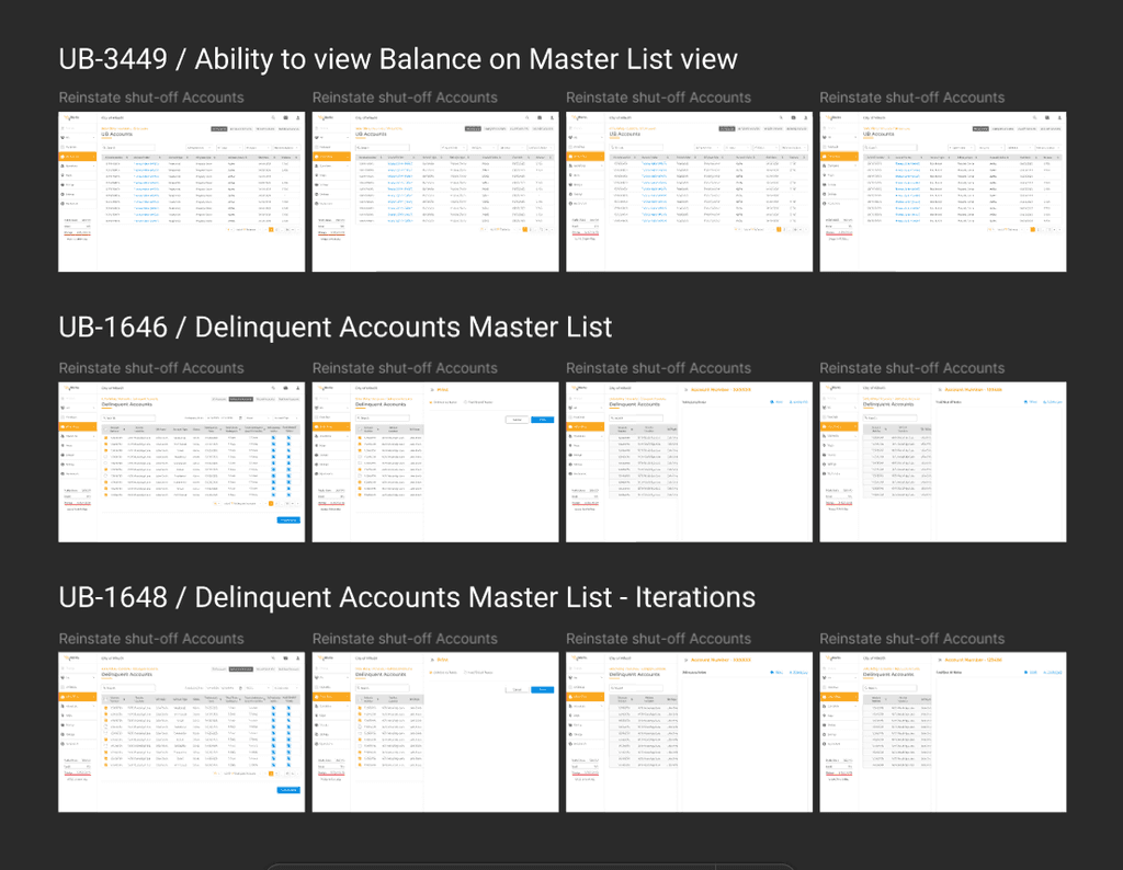
Flag unpaid accounts
Generate shut-off notices for end users to ensure timely payment.
Create service requests
Collaborate with Operations Hub to cut-off services of unpaid accounts.
Existing user flows + Pain points
Repetative tasks
This is consuming productive time of the clerks and their resources of the company.
Old process for new problems
This increases the risk of errors due to manual meter reading.
Manually inform progress of tasks
This is causing communication gaps between stakeholders.
Delays in customer account management
This is increasing electricity consumption without proper records.
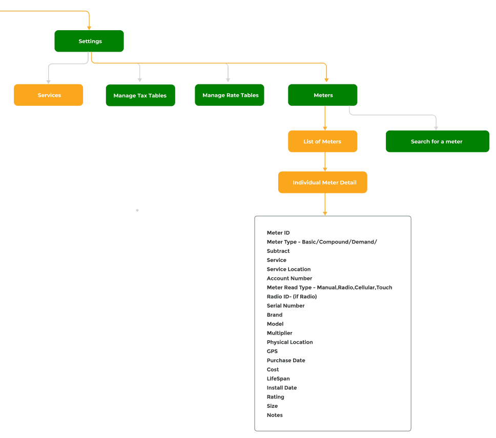
User Flows
User flow for how clerks to correct the bill.
Goal was to create the unified experience for all the hubs in the eco-systems.
We established a set of design principles to ensure the platform met the specific needs of municipal clerks.
These principles guided our decisions throughout the development process, balancing usability and functionality
Simple
for
efficiency
Consistent
for
coherence
Scalable
for
customization
Creating cohesive interface across all 6 applications
We employed an iterative design framework to continuously improve our information architecture based on feedback from design parteners.
It helped us maintain consistency in the call-to-action buttons, sorting filters, and onboarding ensuring a cohesive user experience across multiple applications in the ecosystem.
Screenshot of information architecture for filters in the dashboard
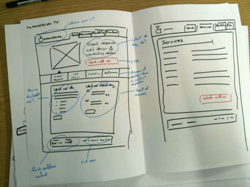
Low Fidelity Wireframes + Feedback Loops
Our design critique sessions involved 3 stages. We collaborated with product teams and engineers to understand technical feasibility.
Continuous feedback sessions were conducted with stakeholders and internal teams to ensure the design was seamless and addressing user needs.
We gathered constructive feedback, allowing us to refine the design concepts in early stages.
This saved development costs by addressing potential issues even before moving to the development phase.

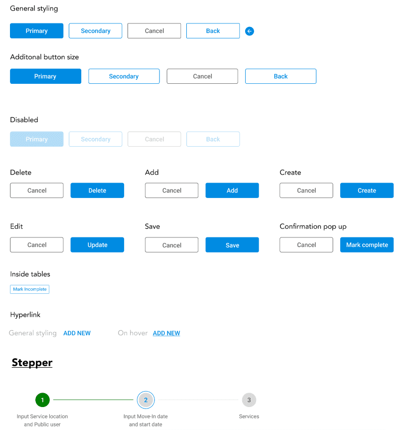
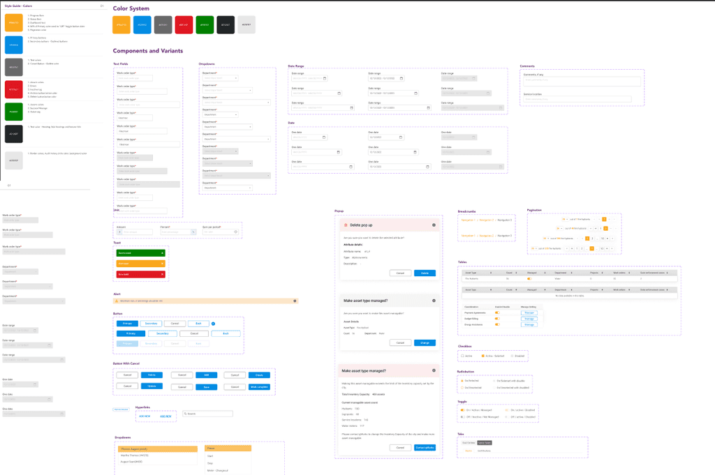
Buttons
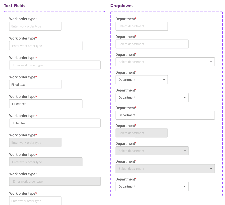
Text Fields
Color
Typography

Typography + Color + Icons
Now we have established our design systems and product outline. After this phase, our focus shifted to individual features in the desktop application. Guided by client-provided user stories, we translated these narratives into UI components.
This approach not only aligned with the client's vision but also enhanced the overall user experience.


Handoff + QA
3 rounds of design QA testing was conducted to ensure the design is replicated in the production.
This involved creating a detailed UI component style guide in Figma for consistency and future expansion of the product.
2500
Local U.S. Governments
48
U. S. States currently using
3X
Efficiency in data visualization
System mapping
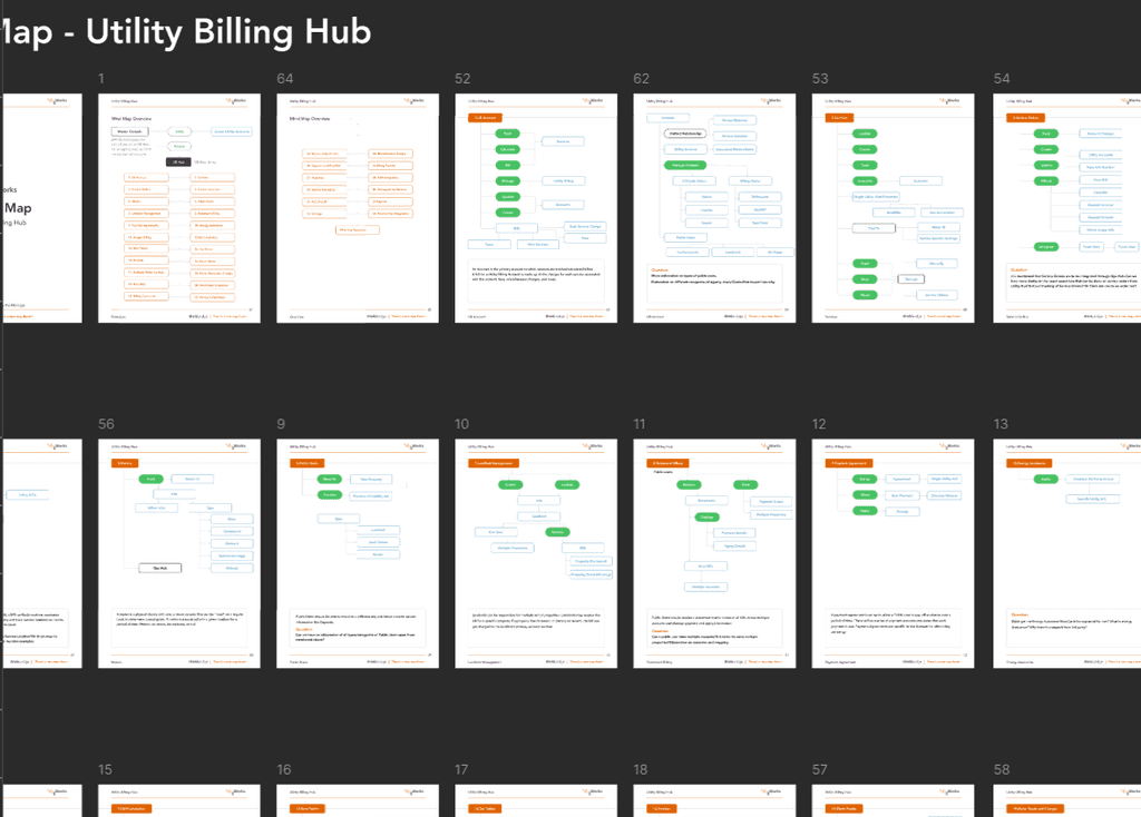
50+ user flow diagrams
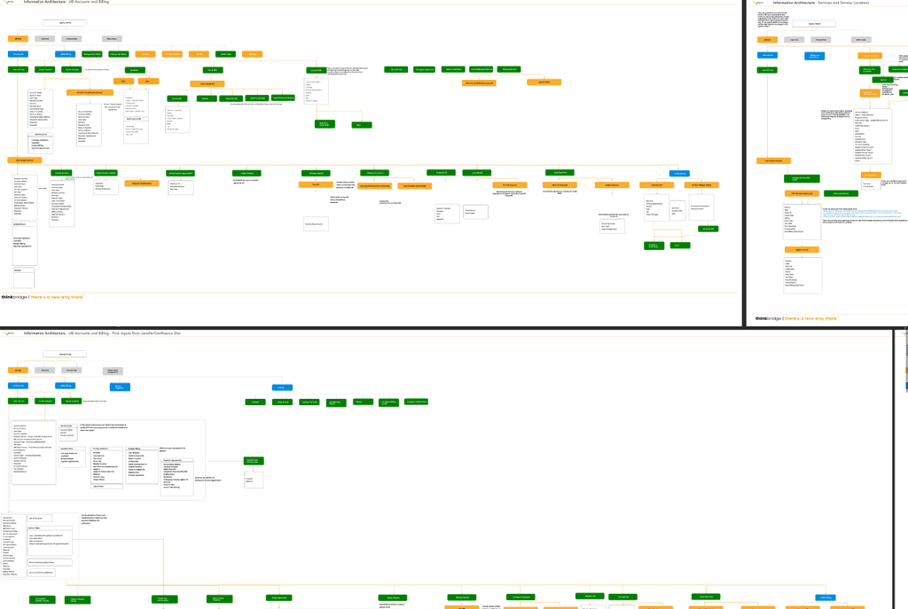
3+iterations of information architecture
2+ iterations of design systems
User Centric
Approach
Reduced Number
of Clicks
Consistency in
Design Language
Improved
Efficiency


Identify areas for further enhancement for continuous improvement of the product.
Conduct last round of usability testing before launch with Clerks to ensure user needs are fulfilled.
Cross-functional collaboration
Collaborating with multidisciplinary teams help understanding technical constraints is crucial in solving complex problems.
Scalable design systems
Scalable design systems helped us maintain consistency across all the 6 applications we designed for stakeholders.